One in a series of posts analyzing urban environments in the United States and around the world. This is the first of two posts about the French town of Neuilly-sur-Seine which lies west of Paris between the Arc de Triomphe and the Grande Arche at La Defense.
In our last post in the Planning Cities Smartly series, I presented a block along Rue de Bac in the Seventh Arrondisement. That block was more urban, more heavily trafficked, than the blocks which are the subject of this post and another which will follow.
I often refer to Neuilly-sur-Seine as the “Brookline” (MA) of Paris, a close-in urban suburb, but Neuilly has both a greater density and a quieter feel that Brookline. The latter is due mostly to the particularly French tradition of hidden gardens and courtyards.
Behind the street-front walls of these blocks, beyond the old carriage doors, lies and assemblage of residential/office mixed uses around landscaped courtyards. These hidden buildings and their courtyards soften the urban context that is apparent from the street.
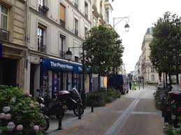
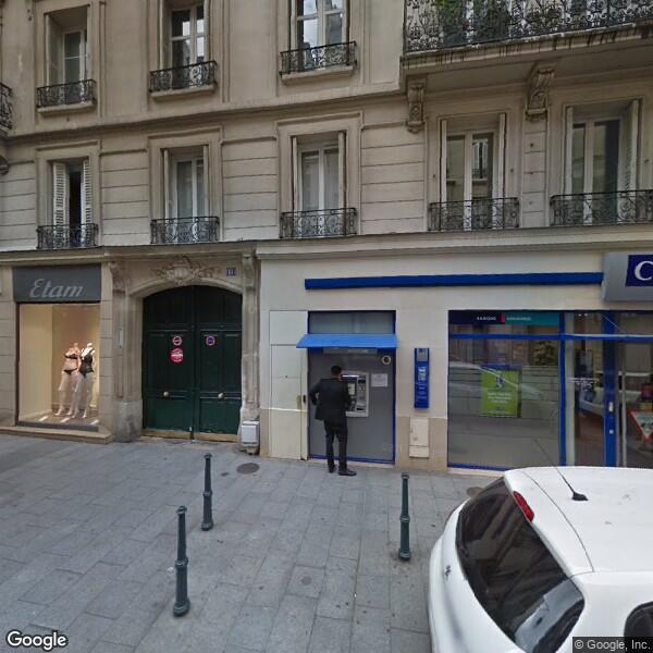
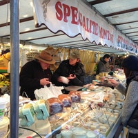
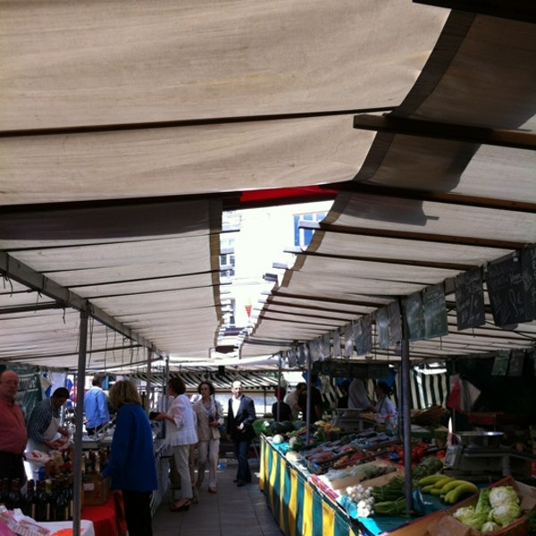
The blocks shown in this post lie on either side of Rue Madeleine Michelis. The street is lined with stores, bakeries and a butcher shop along its length. It is anchored at its southern end by a square that comes to life each Wednesday, Friday and Sunday with a food and merchandise market. The rest of the week it quiets down only slightly as it remains a lively space ringed with restaurants and bistros and a college classroom and administration building. The streetscape along Madeleine Michelis is particularly interesting in that it is very pedestrian without banning vehicular traffic. It has a one-way single lane with limited parking along each side. The street trees are magnolias, an interesting and very successful cloice, and there are a series of well-maintained planters spaces between the trees. In the accompanying photos you will see the landscape of Madeleine Michelis and the excitement of the market as well as an iconic carriage door that conceals the entrance to one of the courtyards.


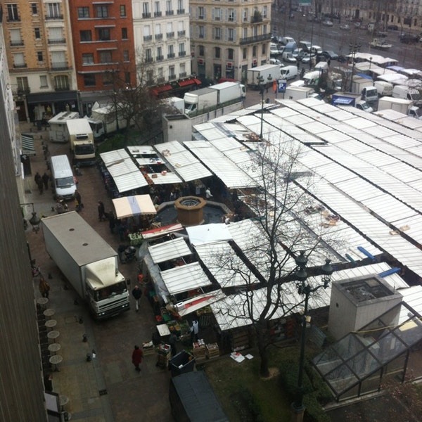
As you look at the birds-eye photo and the pencil sketch, notice the varies texture of the rooftops and building facades. Notice also how intimate the garden spaces are. These are not Place des Vosges scale spaces, they are far more snug and personal.
Neuilly-surSeine at the Marche
The feel that you get in Neuilly-sur-Seine, especially in these precincts, is of an urban excitement and range of possibilities with the always present opportunity to retreat into privacy. On a very different scale, I get some of that same community/privacy feeling in the Old Town section of Marblehead, Massachusetts. That similarity of sense in two very different environments is intriguing and I will visit this idea again.
We hope that you enjoy these posts. You can sign up to receive new posts as they are released.
-
Making Homes
- Jan 21, 2018 Housing Site Design: You Don't Have to Eat the Whole Thing Jan 21, 2018
-
Planning Cities Smartly
- Feb 4, 2018 Urban Design Models: Neuilly-sur-Seine Feb 4, 2018
- Jan 7, 2018 Urban Design Models: The Paris Seventh Jan 7, 2018

